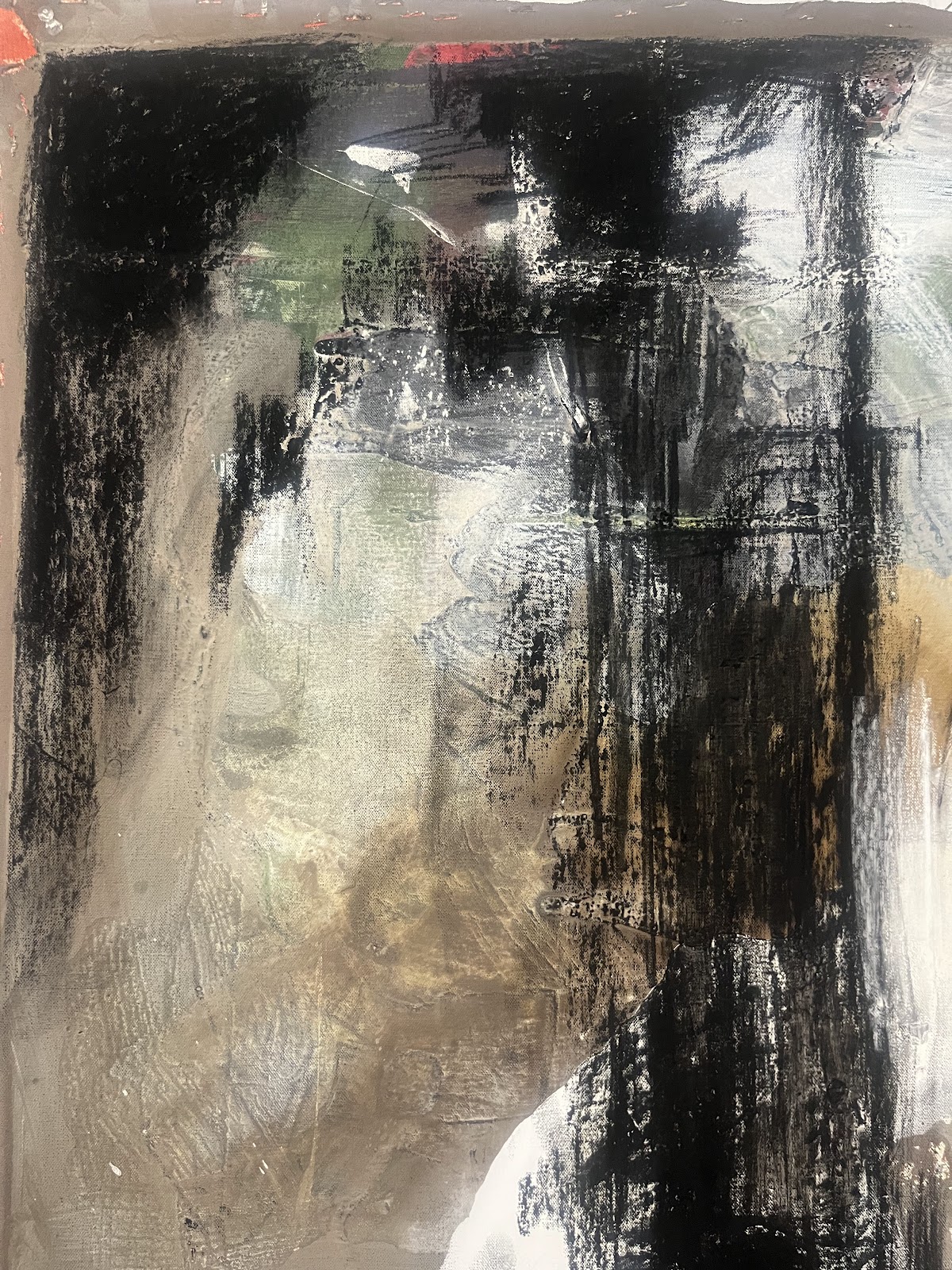
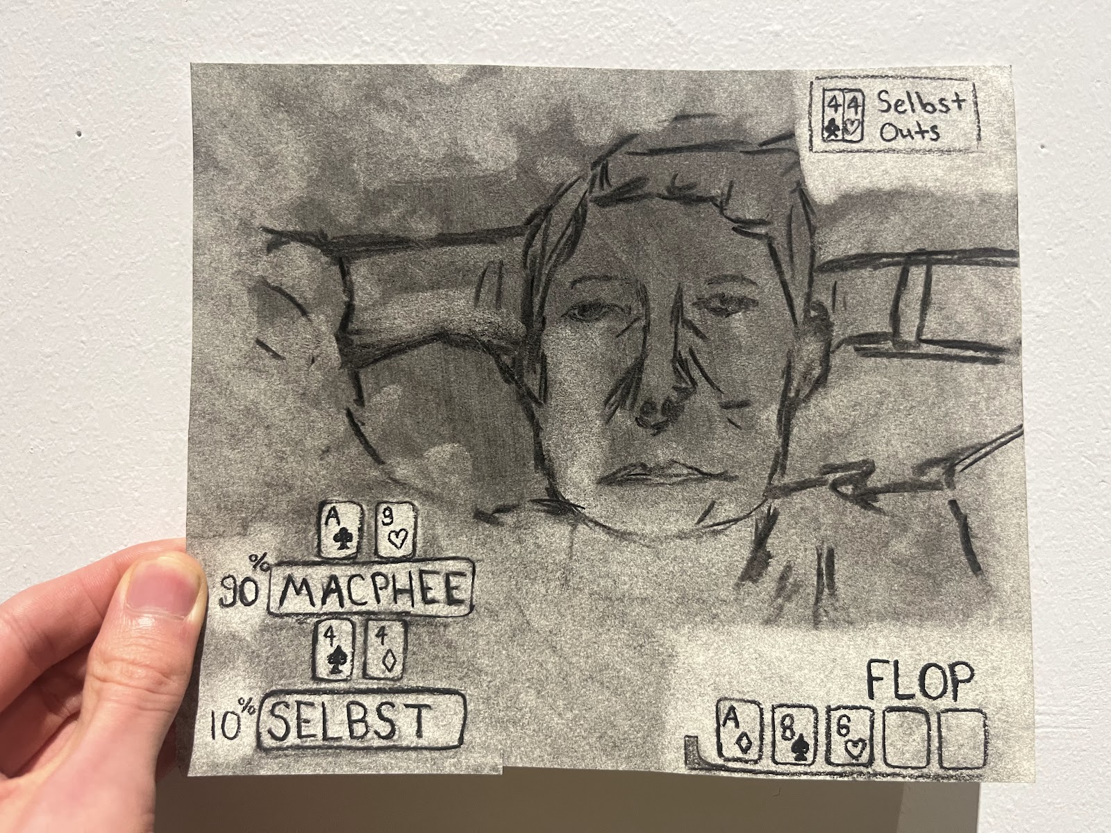
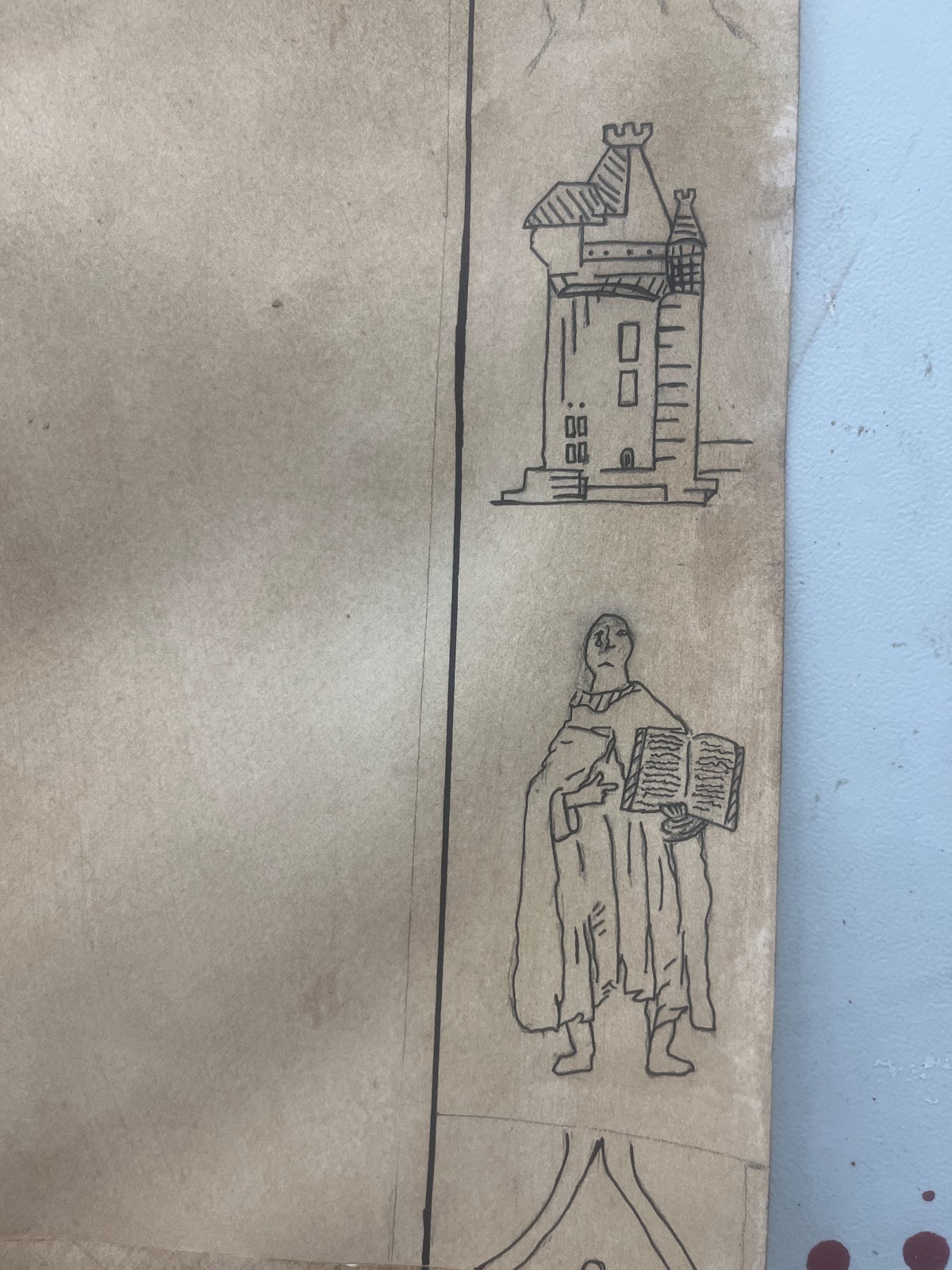
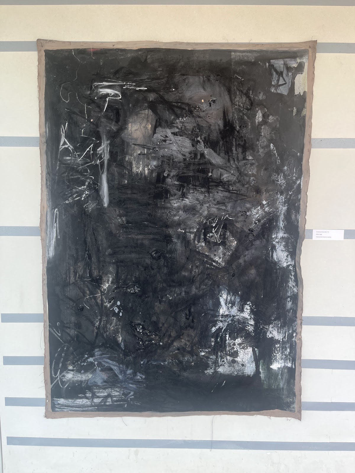
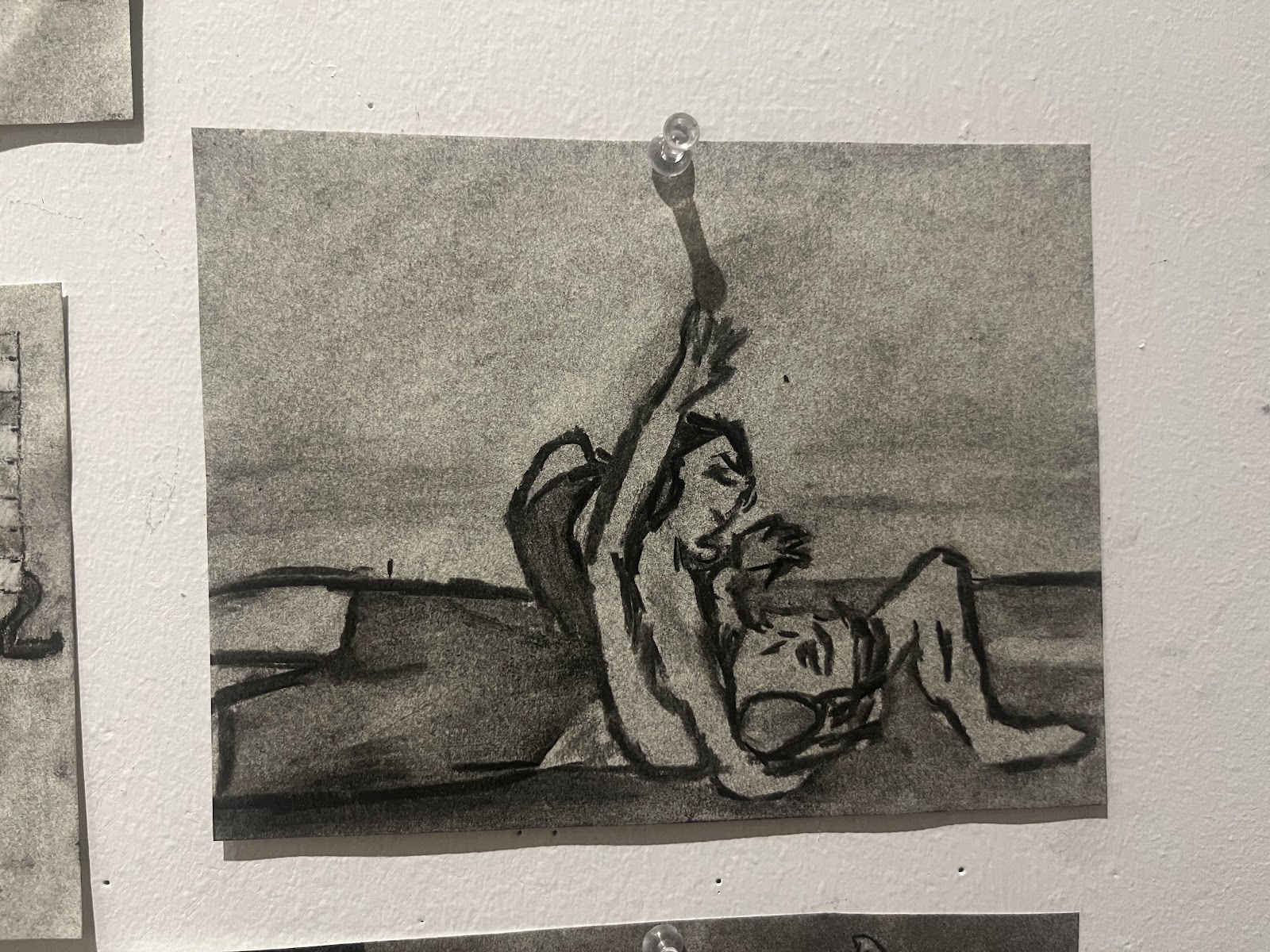
My final project is done. The top images are the newest of the bunch from the term. Large abstract, mostly charcoal and acrylic on canvas. picture 2 is 5' by 7' I believe. picture 3 is 4' by 5'. Picture 4 is 3' by 4'. The drawings of losers and the large map complete the project.
My work becomes text as soon as anyone else interacts with it I think. There are also elements of objects embedded in the paint film. Photos, dried paint that formed up, oil pastels. Each mark I make could be considered a product of culture but I prefer to focus on how people interact with it once it's being showcased.
For the most recent stuff I found experimenting to be the fruits of inovation. By that, I mean I made the best final product when I was trying something new. I had never gone so heavy on the charcoal before and now that I have it will be something I continue with for sure.


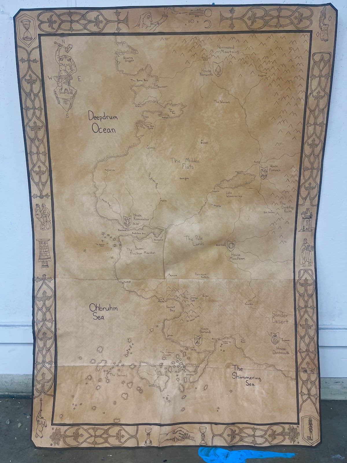
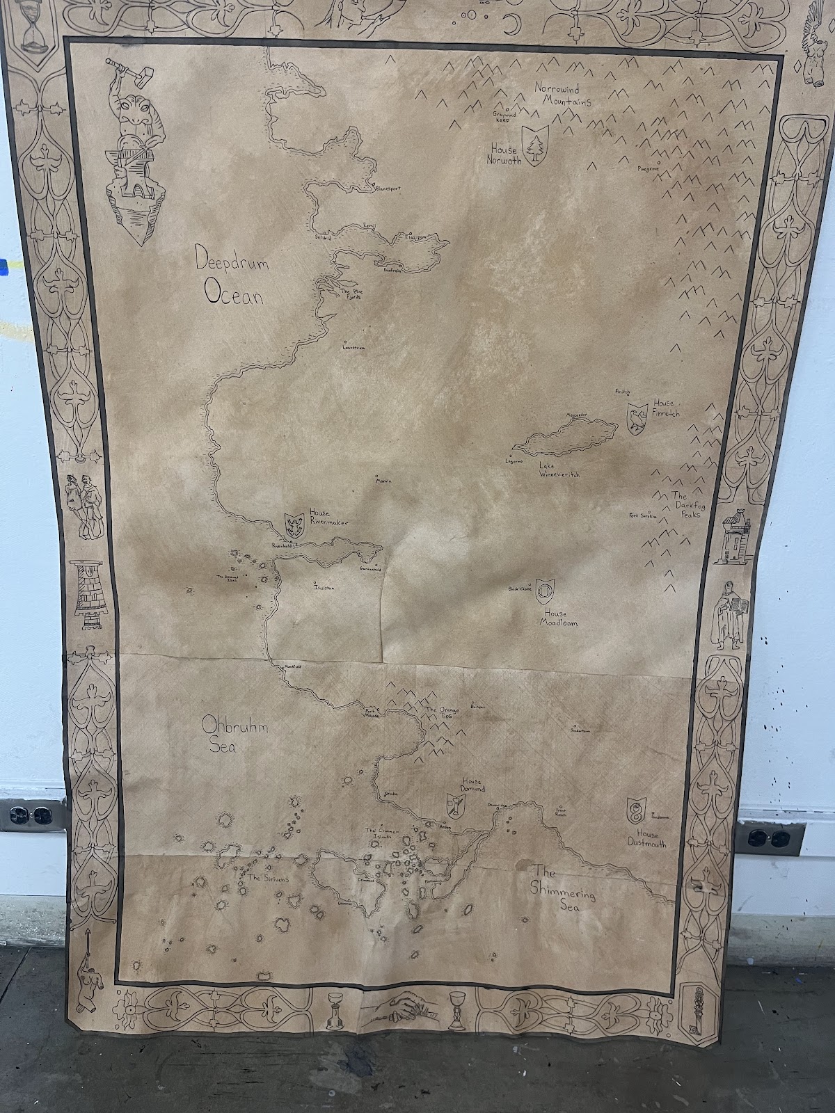
Maps I will also continue with just more casually. I never mean for the map to thrust forward and become a museum item; just a warm, imaginitive thing to look at.
Overall the most important part of my work is the method and the process. I am certain that I will be painting and drawing for the rest of my life because I desperately enjoy the process. Whether it makes me a living or not, I'll always come back to it.